
Analyzing stocks and portfolios with RLadies
This week for R Ladies we did stock market analysis! Led by Scott Clone, the group downloaded data on stock market prices from the internet, reformatted the data, and created portfolios of the stocks based on risk preferences. We were risky investors!
All code here was written by Scott Clone, and I outline in my notes what I learned from the tutorial.
Documents
As usual, all of the documents can be found on the RLadies GitHub page. The documents for this particular tutorial are on Scott Clone’s GitHub.
In this meetup we learned how to:
- Extract stock price data from the internet,
- Group data into stock portfolios based on risk preferences,
- Estimate risk of portfolios, and
- Visualize the portfolios in figures based on returns and weights in our portfolios
Side note: Setting up R chunks in R Markdown (Rmd)
An important part of R Markdown is setting up the R chunks. These R-chunk settings decide if the R code is run and displayed on my blog (where you’re probably reading this!) or if the output is the only visible feature. This is really cool because it means that I can have code that is:
- not displayed, or
- not run, or
- the complete opposite (or some in between).
There are a few settings that allow me to do this (and a lot more to explore).
include = FALSE means that the code doesn’t run when I generate the blog post, therefore not displaying unnecessary errors or notes about loading a package. It also means that the output is not displayed.
echo = FALSE means that the code will not be shown in the post. I set it to TRUE.
message = FALSE means that errors and messages regarding the code will not be shown.
Tutorial: Portfolio Modelling
Downloading stock price and returns data
The below code is a function to download stock data.
getSymbolData is a function with date extraction parameters. In the below example, we set the parameter to extract data from 2019-06-01 until 2019-12-31 and sets column names and values to be r_data, price_data, and returns_data.
# set parameters for the stock dates, as start and end.
getSymbolData <- function(symbolList, start = "2019-06-01", end = "2019-12-31"){
  getSymbols(
    symbolList,
    auto.assign = TRUE,
    from = start,
    to = end,
  )
    p_data <- xts(
    get(symbolList[1])[, 6]
  )
  for (i in 2:length(symbolList)){
    p_data <- merge.xts(p_data, get(symbolList[i])[, 6])
  }
  colnames(p_data) <- symbolList
  # calculate returns for price and returns data, rename columns
  r_data <- na.omit(CalculateReturns(p_data))
  colnames(r_data) <- symbolList
  list(returns_data = r_data, price_data = p_data)
}
We chose to use data from the Bank of Nova Scotia (BNS), Air Canada, Shopify, and GoEasy. These were arbitrary choices, and you can find the companies stock code by just googling “stock [company name].”
This outputs a data frame with stock data for returns and prices from our chosen companies in our chosen time frame.
We group them into the my_stocks. This will be used later on in this tutorial to create portfolios. BUT FIRST! Data cleaning…
# Stocks for BNS, Air Canada, Shopify, goeasy
my_stocks <- getSymbolData(c("BNS.TO", "AC", "SHOP", "GSY"))
Data cleaning
Below we separated the return data and the price data into two separate data frames and renamed the column headers.
#This makes it a data frame of return data.
return_data <- as.data.frame(my_stocks$returns_data)

#This changes the name to BNS_TO from BNS.TO
names(return_data) <- c("BNS_TO", "AC", "SHOP", "GSY")

#Do the same for price data
#return_data$Date <- index(my_stocks$returns_data)
price_data <- as.data.frame(my_stocks$price_data)
names(price_data) <- c("BNS_TO", "AC", "SHOP", "GSY")
To see what the stock returns were like over time, we then plot the data for our chosen time periods. The below plot uses the package Plotly, for interactive plots, to display price data for BNS. Ideally, we would do this for each stock.
# add column name to first column
price_data <- setNames(cbind(rownames(price_data),
                             price_data, row.names = NULL),
         c("Date", "BNS_TO", "AC", "SHOP", "GSY"))

# Look at plot
plotly::plot_ly(
  data = price_data,
  y = ~ BNS_TO,
  x = ~ Date,
  type = "scatter",
  mode = "lines",
  tickangle = 45 #attempting to format the x-axis.
) %>% layout(
  title = "BNS Stock Price",
  margin = list(b = 160), #changes x-axis labels
  xaxis = list(
    type = "date"
  ),
  yaxis = list(
    title = "Price"
  )
)
Creating a portfolio: to be risky, or to be safe?
We will now test the risk and returns of a portfolio containing the stocks for BNS, Shopify, GoEasy, and Air Canada. Portfolios are groups of stocks someone choose to invest in. By investing in multiple stocks, someone can mitigate the risk of loosing money, as their risk is distributed over more companies. I.e., not putting all your eggs in one risky basket. Investopedia has more information if you’re interested.
Below, we take the original data frame, my_stocks, and separate out returns and price data. This differs from the earlier separation of price and returns data as we do not save it as a data frame using as.data.frame but instead as a xml document. This type of document can then be processes by the portfolio analytic package.
To test returns, we take the average returns and variance/standard deviation of returns. Scott explained that variance/standard deviation of data for stock market analysts is what investors call risk.
# Separate returns data, in xts format.
returns <- my_stocks$returns_data

# Separate price data, in xts format.
price <- my_stocks$price_data

# Calculate the average returns and risk (covariance matrix)
mean_returns <- colMeans(returns)
cov_matrix <- cov(returns)
Deciding on your risk and return preference in your portfolio.
The below code then combines all of the returns data from each company into the data frame my_folio, or the portfolio. Assets are the stocks you own.
# Create the portfolio
my_folio <- portfolio.spec(assets = colnames(returns))
As described by Scott, we can then set our risk levels with the min and max options. He did not specify what the values in the risk min and max mean, but they vary from 0 to 1.
Below is a medium risk portfolio, with min set as 0.05 and max set as 0.65.
# Add constraint
my_folio <- add.constraint(
  portfolio = my_folio,
  type = "box",
  min = 0.05, #these are risk
  max = 0.65
)
Or we could set a very risky portfolio! Below the very risky portfolio is set with min as 0.99 and max as 1.01. Vegas here I come!
These functions are determining how much of each stock a person should buy from the set list of companies to get returns at their preferred risk level.
my_folio <- add.constraint(
  portfolio = my_folio,
  # The type means the type of investment
  type = "leverage",
  min_sum = 0.99,  #this is very risky
  max_sum = 1.01
)
Maximize returns: How much of each stock to put in the portfolio
We can then run the optimize.portfolio function to optimize returns based on our risk parameters. The function here analyzes the returns data for the stocks we selected and suggest how much of each stock we should put in our portfolio.
# Maximize the average returns with return on investment (ROI)
max_return <- add.objective(
  portfolio = my_folio,
  type = "return",
  name = "mean"
)

# Optimization
opt_max_return <- optimize.portfolio(
  R = returns,
  portfolio = max_return,
  optimize_method = "ROI",
  trace = TRUE
)
One can then use the below print commands to print out results from the optimize portfolio function. The results are quite long, so I don’t include them in this post.
# these print the details on how much I should invest.
#print.default(opt_max_return) #this prints a lot more than the other one.. (after)
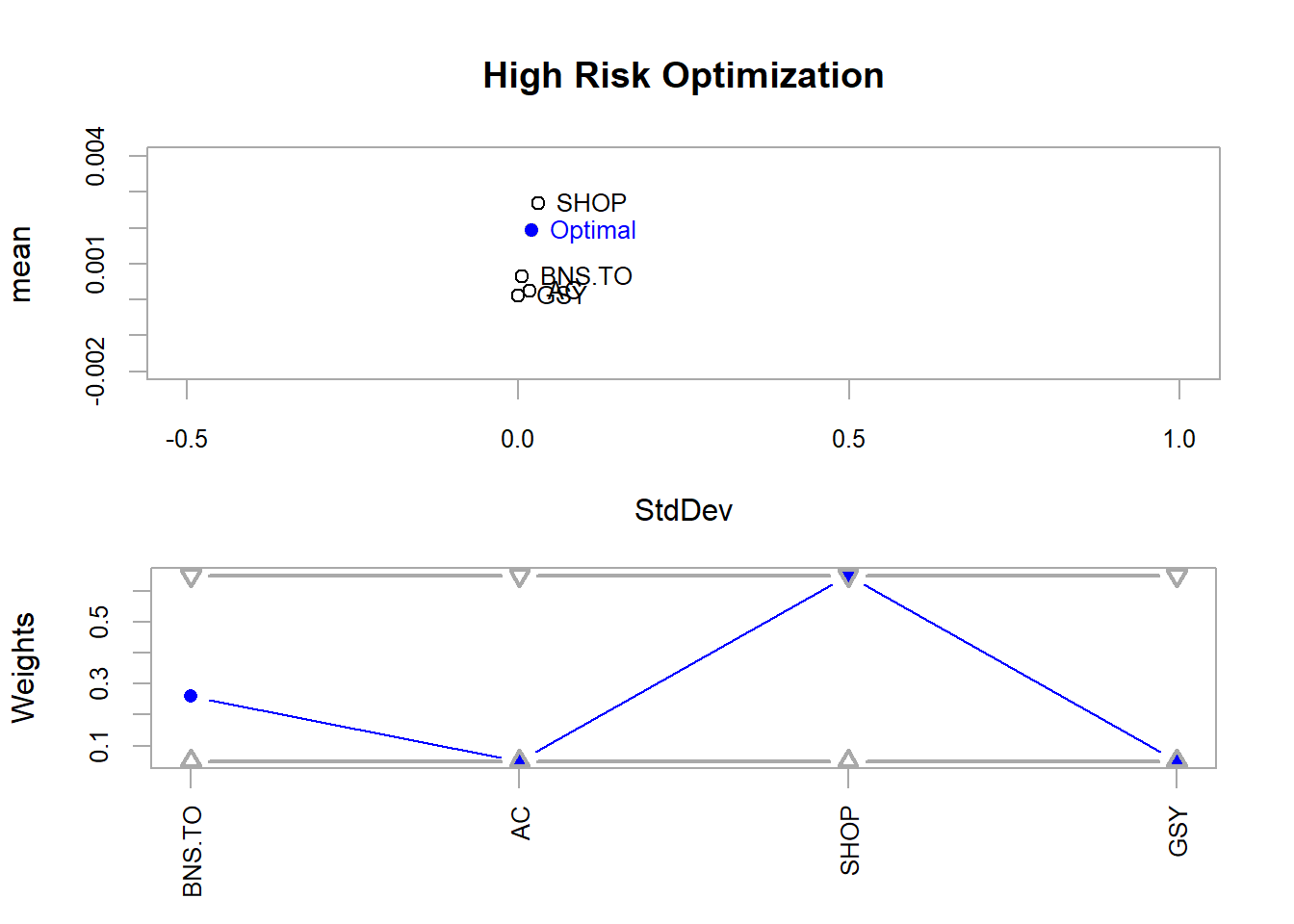
#print(opt_max_return)Below is a plot that visually displays how much of each stock should be in the portfolio to maximize returns. It needs some visual work, but in essence, the x-axis shows the standard deviation, or risk, of the portfolio. The y-axis shows the average returns for the top chart and the weight of each stock in the portfolio for the bottom chart.
This figure shows that, at high risk or when searching for max returns, we should mostly buy Shopify stocks. It makes sense that a start-up, Shopify, would be riskier than Air Canada or the Bank of Nova Scotia.
# Plot optimized maximum mean (i.e. return?)
plot(
  opt_max_return,
  risk.col = "StdDev",
  return.col = "mean",
  main = "High Risk Optimization",
  chart.assets = TRUE, #this adds the individual stocks to the figure
  xlim = c(-0.5, 1),
  ylim = c(-0.002, 0.004)
  #title(xlab = "Risk", ylab = "Average Returns")
  )
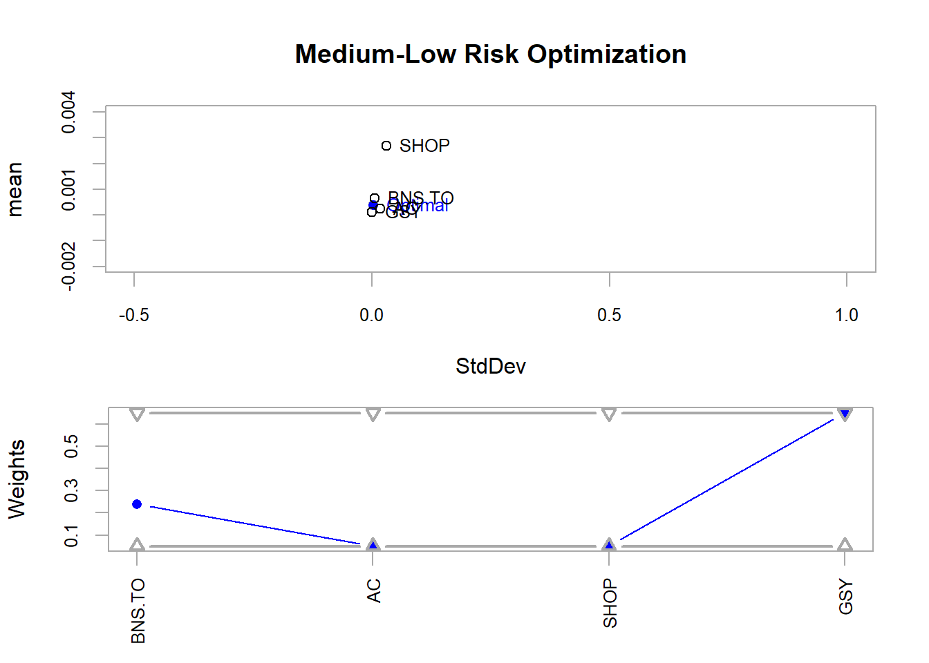
The below code does a similar function to maximize returns, but instead minimizes risk.
# Plot optimized minimum var (i.e. risk)
plot(
  opt_min_var,
  risk.col = "StdDev",
  return.col = "mean",
  main = "Medium-Low Risk Optimization",
  chart.assets = TRUE,
  xlim = c(-0.5, 1),
  ylim = c(-0.002, 0.004)
)
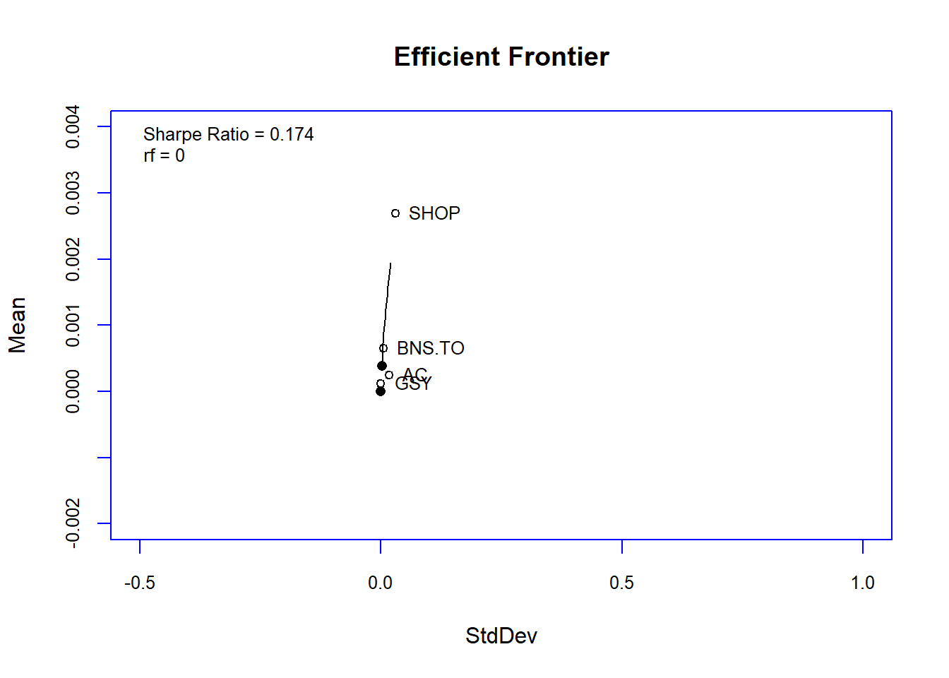
The Efficient Frontier
In the end, we plotted our portfolio against the efficient frontier! From a quick google and what I remember of the tutorial, the Efficient Frontier helps position the portfolio in its risk and returns level.
Apparently, optimal portfolios should lie on the curve displayed in the image below.
Wow, this was a throw back to my business school days!
# Plot efficient frontier!
chart.EfficientFrontier(
  meansd_ef,
  match.col = "StdDev", # which column to use for risk
  type = "l",
  RAR.text = "Sharpe Ratio",
  tangent.line = FALSE,
  chart.assets = TRUE,
  labels.assets = TRUE,
  xlim = c(-0.5, 1),
  ylim = c(-0.002, 0.004),
  element.color = "blue"
)
This was quite a dive into R analysis of stocks and portfolios! Thank you again Scott for putting together the tutorial and pushing my knowledge of R into a new domain. Apologies for the horrendous figures. All of my R experience is with ggplot and not base R plotting. An area to improve for next time!
- Happy weekend,
- Megan